
We Built a Real-Time User Performance Dashboard — and It Told Us Something We Didn't Know
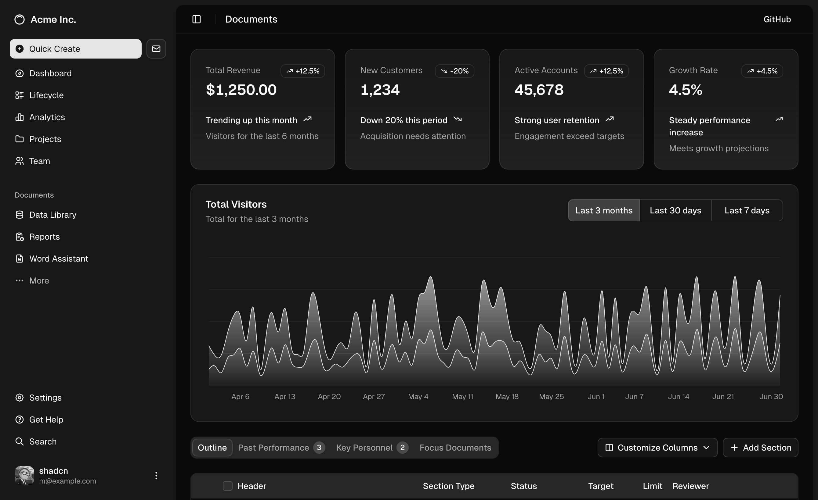
Every ERP logs everything — but raw audit logs are like CCTV footage with no fast-forward button. So we built a live analytics layer on top, and Day 1 already changed how we think about a working day.
We built a real-time User Performance Dashboard into our Cloud ERP — and it immediately told us something we didn't know.
Here's the story.
Every ERP system logs everything. Every record added. Every field edited. Every lookup. Thousands of rows, every single day.
But raw audit logs are like CCTV footage with no fast-forward button. The data is there. The insight is not.
So we built a live analytics layer that sits on top of every project's audit log — and answers the questions managers actually ask:
The questions managers actually ask:
- Who is the most productive user today?
- Is anyone logged in but not actually working?
- Which modules are getting attention — and which are being ignored?
- What time of day does real work happen?
What we built
- No third-party BI tool. No bloated reporting module.
- Just clean SQL, Chart.js, and a purpose-built UI — available across all our client deployments.
The dashboard calculates metrics that don't exist natively in audit logs:
Custom metrics layered on top of the audit log:
- Active Time — gap between first and last action in a session
- Idle Time — flagged when there's no action for 20+ minutes
- Efficiency — ratio of productive actions to total active time
- Avg/Day — rolling daily average to catch spikes vs. normal output
What we discovered on Day 1
- 6 active users. 174 total actions. 13 entries.
- That ratio — 174 actions but only 13 entries — tells the real story. Most of the day's work was lookups and cross-referencing, not data creation. Typical for a reporting/query day.
The heatmap was the biggest surprise. We expected to confirm what we already knew: peak activity in the morning.
Instead, we found that ALL productive entry work happened in a single 2-hour window: 11:00–12:00. Not four hours. Two hours.
That's actionable. If you need something entered accurately and fast, that pre-lunch window is when your team is at peak focus. Schedule data-heavy tasks accordingly.
What the dashboard doesn't tell you (and why that matters)
- Entries ≠ Quality.
- Idle time ≠ Unproductive time.
- Low efficiency score ≠ Bad employee.
- A flagged idle session might be a phone call with a supplier. A high lookup count might be critical research for a purchase decision.
We built these caveats into the UI itself — showing total actions alongside entries so the full picture is always visible, not just the headline number.
Dashboards should start conversations. Not end them.
Three things we learned building this:
- Start with the questions, not the data. We began with 6 questions we actually needed answered — then worked backward to metrics and charts.
- Efficiency is the metric people care about most. Not total entries. Not active time. When we showed team leads early versions, the first thing they asked: "What's my efficiency score?"
- Dark mode first. Operations staff work in mixed lighting environments. We designed for their screens, not ours.
Next up on the roadmap:
- Week-over-week trend lines
- Module health scores
- Anomaly alerts when a critical module goes unexpectedly quiet
Because knowing what happened yesterday is useful. Knowing it the moment it changes is powerful.
This dashboard comes standard with every Merciglobal Cloud ERP deployment — across manufacturing, textile, logistics, port, and trading businesses in India and the Gulf.
If you're running operations on spreadsheets and gut feel — let's talk.